- From Survival to Thrival
- Posts
- Thursday January 30- Your readers
Thursday January 30- Your readers
Ephraim Gopin
January 30, 2025
Hi !
💰️ Hiring a babysitter: Publisher’s note
Before jumping in this week, I wanted to add a quick note:
I know about the White House suspending all federal grants (which was rescinded a couple of days later). I know that some (many?) of you were in panic mode and stressed out.
I will address something related to the issue next week. I thought about doing so today but need a few days to let my thoughts percolate. But there is a pain point that needs to be discussed.
And now on to our regular show…
📹️ Trailer: TL;DR version
When producing fundraising and marketing materials, you need to keep in mind who will read it. The average donor is over 60 and they can’t read your letter or email when the font size is tiny and you’ve crammed all the info into a small space.
Organizations should:
Use a large font size- both in direct mail letters and email
Leave plenty of whitespace
Use short sentences and paragraphs
See the action section for more about this week’s pain point. (While you’re at it, email me if you know what great 80s movie I reference this week. And I’m not referring to the one in the P.S.)
✍️ Coming attractions: Do you have a plan?
Does your nonprofit have an approved plan/strategy for... |
👓️ The opening: Not a happy camper

This is the first public post I’m sharing in which I’m wearing glasses.
I went 52 years without them. But time and age caught up with me. Now I use glasses to read.
Sigh. I’m not a fan. It stinks but read with them I must.
Know who else wears glasses? A very decent size of your nonprofit’s audience.
The average age of a donor is over 60. Eyesight starts to deteriorate in one’s mid forties. Add in 20% of the population have a disability, including those with various eyesight issues.
Which means you need to think about your readers when you send them printed or electronic materials.
The problem is made worse by the fact that the average fundraiser is around the age of 40. Their eyesight might be fine and they may not fully consider who will be reading what they’ve sent.
Let’s dive into this week’s pain point, not an organizational pain point but one your supporters experience. Let’s discuss readability.
🎦 The action: Very hard to read
I’m seven years old, sitting on Bubbie’s (Yiddish word for grandmother) lap in the kitchen of her house in Cleveland.
I brought a Spiderman comic book to the table and asked Bubbie to read it. Bubbie opens it and because everything is written so small, she has trouble deciphering the words in the conversation bubbles.
“Bubbie” I blurt out, “go get your glasses!”
As an organization it can be easier to deal with your internal pain points instead of the pain points of others. But I can tell you this for sure: You need to think about others or you’ll raise a lot less money.
Specifically take into account how easy it is to read your materials. People won’t react to what they can’t read.
Let’s talk about readability for a minute.
Longer letters perform better than short ones in direct mail campaigns. A four-page printed letter will outperform a two-page letter. (Here’s why.) With email, shorter is better. (Here’s why.)
But for both of them, if people can’t read what you mailed/emailed them they’re gonna move on elsewhere. If they have to squint or pinch the screen to enlarge the wording, they won’t bother. People are busy and they have other things to do than burning energy on your letter where you tried to cram everything into one page.
(Why was everything crammed? Because of an internal pain point- you wanted to save money on printing. And now fewer people will donate because they can’t read your letter. 🔫 , meet 🦶 )
What can you do to make it easy for your audience to read your materials?
Font size: Bigger is better. Use a font size of fourteen or bigger. For email, twelve should be ok, though I’ve seen some recommend 16 or higher. Keep in mind that people will be skimming and scanning your letter/email/brochure/report. Make it easy for them to do so.
White space: Have lots of it! The more white space (on the sides and between paragraphs/sections) the better. Makes it easier for people to read.
Pad those buttons: In emails make your call to action (CTA) buttons larger. No one should have to zoom in to read your CTA. Make it easily readable and clickable.
Stand out: Have something you want people to pay attention to? Bold it. Use bolded headlines and section titles. Use a dark color for your email CTA button so it stands out on the white background. And yes, use white as the color of the words on your CTA button. Easy for people to pick out and read.
Short sentences, short paragraphs: Your writing should be conversational, like you’re in the room talking to the donor. That means short sentences. I also advise no more than three sentences to a paragraph.
Break it up: People’s attention spans are… well, goldfishesque. Break up the text with images, bullet points, section breaks and standalone quotes. Reading in small bits is much easier.
Want people to respond to what you send? Make it easy for them to read. They may have to wear glasses while reading but that should be the only “difficulty” they encounter.
Be thoughtful and cognizant of the pain points of your readers. It’ll help you build more relationships and raise more money.
👏 The big finish: A little of this and that
Here’s some great content for you to learn from:
How to build relationships with donors (NUMBER TWO!!!) (Byrne Pelofsky)
How to demonstrate your organization’s impact online (Care 2)
15 sites to find music/tracks for your YouTube videos (Buffer)
📜 Roll credits: Check before posting
Mistakes will happen. Sometimes you’ll forget that you were meant to add something before you post.
Which is why, before you post or publish or send, double check. Triple check. Otherwise what you publish might just be a lot of blah blah blah.
And in case you’re wondering: Don’t ask how many times I check my enews before I send. Mistakes drive me nuts (but I also encourage you to point them out to me so I can do better next time).
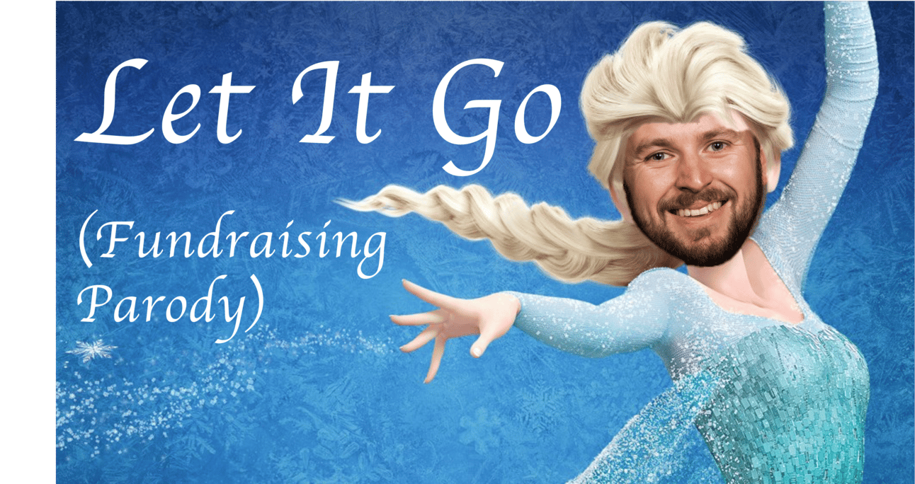
🏡 You’re still here? It’s over. Go home. Go. Chicka chicka: Let It Go
If you’re in the nonprofit sector, you know about fundraising and grants. You not only know but have felt every pain point there is.
David Burgess, a fundraising consultant and wonderful guy, has decided to share these pain points in song form. As one review put it: “You’ve taken a song everyone is sick of hearing and made it even worse.”
If you need a good laugh, then listen to David’s version of Let It Go. He feels your pain.
I’ll be back next Thursday. Have a great weekend!
P.S. I listened to John Parr’s “Man in Motion” (St. Elmo’s Fire) on an endless loop while working on the enews. Important to note: Demi Moore’s hair in that movie is to die for!